The ROI of email marketing has been very stable over the years. However, complacency is still a luxury that email marketers can’t afford. They must respond to a number of trends that impact their campaigns. One of the biggest trends is the growing number of users that check their email on mobile devices. Around 65% of all emails are opened on mobile devices today, so your email campaigns will fail if you only optimize them for desktop users.
Marketers will need to shift their optimization strategies towards mobile users. Before you start optimizing your devices, keep in mind that you can’t easily segment your email campaigns by device, the same way that you can with other marketing strategies. When your run a CPC campaign to generate email subscribers, you can target users by device type and optimize your ads and landing pages accordingly. Unfortunately, those users may check their emails from a variety of different devices, which means every email needs to be designed for a host of different devices.
Here are some strategies to optimize your email template for mobile.
1. Kick Your KISS Strategy Into Overdrive
Simplicity is essential for email marketing in general. Long-winded emails trying to convey complex concepts are going to go over your readers’ heads. They don’t want to read a lot of content.
This is even more true with mobile email marketing. Your subscribers will be reading your emails on smaller screens, so you need to make them even more concise. Campaign Monitor created an awesome guide about optimizing your emails for mobile devices, which emphasizes how to increase open rates significantly when you’re dealing with a much smaller screen size. With most desktop email clients allowing subject lines of up to 80 characters, mobile devices will be around 30 before being cut off from view. If your CTA in the subject line if after the cut off you will see significantly lower open rates.
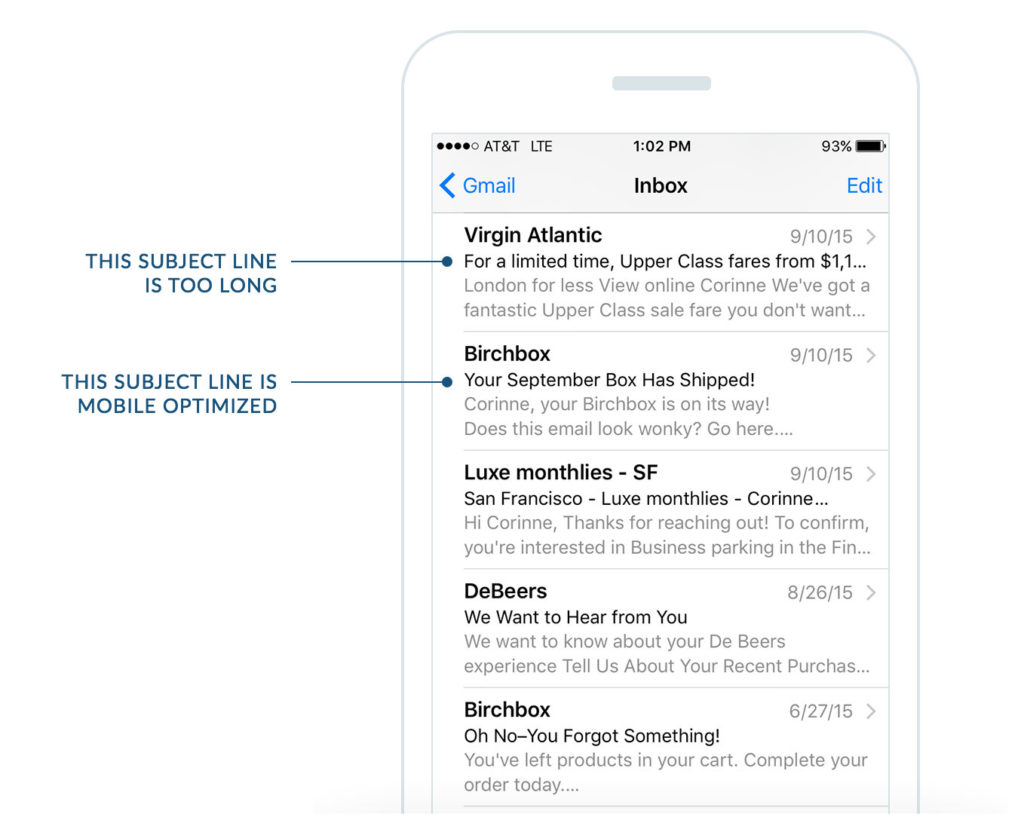
In addition, your preheader text is the content that is shown below the subject line on mobile devices to give the user an idea of what the email is about. Optimize your preheader text to “sell” the reader on what’s inside the email and increase open rates. While different mobile email clients show a range of characters in the preheader, keep the characters between 40-50 to ensure it isn’t being cut off.
2. Use Single Column Templates Less than 600 Pixels Wide
After web designers started developing content for mobile users, they found that even using carefully constructed <div> tags didn’t ensure their content was properly organized. Structuring multi-column email templates is multiple times harder. The content will look far too condensed, even if you try to add plenty of white space, simply because there isn’t enough room for everything.
A case study from Constant Content found that you can eliminate most of these headaches by using a single column template
for all of your emails. If you keep it under 600 pixels wide, it will be much easier to organize your content properly.
3. Embrace Fluid Designs
Fluid designs use percentage ratios for widths and heights, rather than fixed pixel limits. They became popular with website design as a growing number of devices with different screen sizes reached the market. However, fewer people use them for email design.
Marketers that aren’t using fluid email designs should consider making the transition. It will help make sure the right amount of white space is used for every device, avoid having important content cropped and prevent one of your images from crowding out your copy.
4. Use Your CTA More Quickly
As a general rule of thumb, you want to have a strong CTA above the fold in every email. This doesn’t mean that you need to end your email there, but you should at least make sure that it gets attention. You can add additional content and follow-up with a final CTA at the end.
The above the fold guidelines will be very different for mobile and desktop email designs. Your mobile users are going to see less content on their screen in each email thread, so you need to place your CTA much higher.
It is a good idea to use a screen resolution testing tool to see how your emails will be viewed on different devices. Your CTA should appear above the fold in every device, because you can’t easily segregate your campaigns by device type the way you can other variables.